Pandas time!
26 Aug 2015Before I move on to trying more complicated things that I would do with MATLAB (e.g. 3D plotting), I want to learn the basics of the thing I would like to do on R, namely data crunching and visualization.
For that I will use mtcars database because:
- It’s simple.
- It’s standard.
- Flowers are boring.
- Saddly, there’s no simple, standard, motorcycles database.
So first I need to load the Pandas library. This library will introduce the DataFrame object much like R’s own data.frame.
import pandas as pdThere’s a package that brings RDatasets to Python, but I saved mtcars as a CSV (comma separated values) file because reading my own data from Python is a very important step. Which by the way is very easy:
cars = pd.read_csv("mtcars.csv")To print what I just read, there’s a head function. It will shows us the first bunch of rows. head(n) will give you the first n rows, but let’s use the default.
cars.head()| Unnamed: 0 | mpg | cyl | disp | hp | drat | wt | qsec | vs | am | gear | carb | |
|---|---|---|---|---|---|---|---|---|---|---|---|---|
| 0 | Mazda RX4 | 21.0 | 6 | 160 | 110 | 3.90 | 2.620 | 16.46 | 0 | Manual | 4 | 4 |
| 1 | Mazda RX4 Wag | 21.0 | 6 | 160 | 110 | 3.90 | 2.875 | 17.02 | 0 | Manual | 4 | 4 |
| 2 | Datsun 710 | 22.8 | 4 | 108 | 93 | 3.85 | 2.320 | 18.61 | 1 | Manual | 4 | 1 |
| 3 | Hornet 4 Drive | 21.4 | 6 | 258 | 110 | 3.08 | 3.215 | 19.44 | 1 | Automatic | 3 | 1 |
| 4 | Hornet Sportabout | 18.7 | 8 | 360 | 175 | 3.15 | 3.440 | 17.02 | 0 | Automatic | 3 | 2 |
We can see that there’s no name for the first column. We could add a name like “carname”, but in this case the name of the car represents a single row, so maybe we should use it as a name for the row instead of just $1,2,3,\dots$
cars = pd.read_csv("mtcars.csv",index_col=0)
cars.head()| mpg | cyl | disp | hp | drat | wt | qsec | vs | am | gear | carb | |
|---|---|---|---|---|---|---|---|---|---|---|---|
| Mazda RX4 | 21.0 | 6 | 160 | 110 | 3.90 | 2.620 | 16.46 | 0 | Manual | 4 | 4 |
| Mazda RX4 Wag | 21.0 | 6 | 160 | 110 | 3.90 | 2.875 | 17.02 | 0 | Manual | 4 | 4 |
| Datsun 710 | 22.8 | 4 | 108 | 93 | 3.85 | 2.320 | 18.61 | 1 | Manual | 4 | 1 |
| Hornet 4 Drive | 21.4 | 6 | 258 | 110 | 3.08 | 3.215 | 19.44 | 1 | Automatic | 3 | 1 |
| Hornet Sportabout | 18.7 | 8 | 360 | 175 | 3.15 | 3.440 | 17.02 | 0 | Automatic | 3 | 2 |
If you happen to know the dataset, you’ll notice that I changed the variable am from binary to text. I did this to explore pandas use of categorical data from text.
Speaking of that, let’s see how the data was saved in our variable.
cars.info()<class 'pandas.core.frame.DataFrame'>
Index: 32 entries, Mazda RX4 to Volvo 142E
Data columns (total 11 columns):
mpg 32 non-null float64
cyl 32 non-null int64
disp 32 non-null float64
hp 32 non-null int64
drat 32 non-null float64
wt 32 non-null float64
qsec 32 non-null float64
vs 32 non-null int64
am 32 non-null object
gear 32 non-null int64
carb 32 non-null int64
dtypes: float64(5), int64(5), object(1)
memory usage: 3.0+ KB
We can see some important data on the…data (Metadata?). How each variable is stored and the memory size of the DataFrame. This is a really small dataset, but with bigger files this would be more and more important to be aware of.
Other function that seems very useful is describe, which summarizes the columns in the most standard statistics: count,mean, standard deviation and quartiles.
cars.describe()| mpg | cyl | disp | hp | drat | wt | qsec | vs | gear | carb | |
|---|---|---|---|---|---|---|---|---|---|---|
| count | 32.000000 | 32.000000 | 32.000000 | 32.000000 | 32.000000 | 32.000000 | 32.000000 | 32.000000 | 32.000000 | 32.0000 |
| mean | 20.090625 | 6.187500 | 230.721875 | 146.687500 | 3.596563 | 3.217250 | 17.848750 | 0.437500 | 3.687500 | 2.8125 |
| std | 6.026948 | 1.785922 | 123.938694 | 68.562868 | 0.534679 | 0.978457 | 1.786943 | 0.504016 | 0.737804 | 1.6152 |
| min | 10.400000 | 4.000000 | 71.100000 | 52.000000 | 2.760000 | 1.513000 | 14.500000 | 0.000000 | 3.000000 | 1.0000 |
| 25% | 15.425000 | 4.000000 | 120.825000 | 96.500000 | 3.080000 | 2.581250 | 16.892500 | 0.000000 | 3.000000 | 2.0000 |
| 50% | 19.200000 | 6.000000 | 196.300000 | 123.000000 | 3.695000 | 3.325000 | 17.710000 | 0.000000 | 4.000000 | 2.0000 |
| 75% | 22.800000 | 8.000000 | 326.000000 | 180.000000 | 3.920000 | 3.610000 | 18.900000 | 1.000000 | 4.000000 | 4.0000 |
| max | 33.900000 | 8.000000 | 472.000000 | 335.000000 | 4.930000 | 5.424000 | 22.900000 | 1.000000 | 5.000000 | 8.0000 |
As a shortcut for visualization, there’s another cool feature of pandas: we can call plot directly to the DataFrame. This allows to plot a histogram (or whatever) of some columns directly to see what we are doing. For this we need the plotting library.
import matplotlib.pyplot as plt
%matplotlib inline
To select a single column of our data, pandas uses []. So for example we can get the mpg variable and get the histogram right out of the DataFrame object with:
cars['mpg'].hist()
plt.show()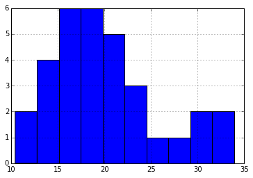
Now we can visualize some pandas functionality. For example, we can easily group by type of transmission using the groupby function. I take cars, select the columns ‘mpg’ and ‘am’, then apply the groupby function to tell pandas I want to group by ‘am’, and that I want to summarize the rest using the function mean. Finally I plot it.
cars[['am','mpg']].groupby('am').mean().plot(kind='bar')
plt.show()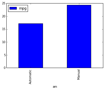
How about a scatter plot? Maybe I would want to see the relationship between miles per gallon vs the horse power.
plt.scatter(cars['mpg'],cars['hp'])
plt.show()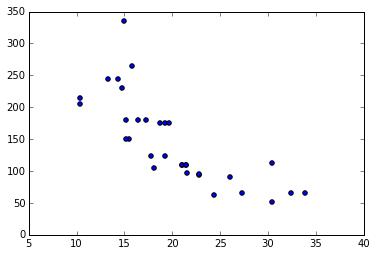
What about beautiful plots?
By this time some may be missing ggplot because of its elegant style. Well, matplotlib has different possible styles, included the beloved ggplot, only by setting style.use
plt.style.use('ggplot')
plt.scatter(cars['mpg'],cars['hp'])
plt.show()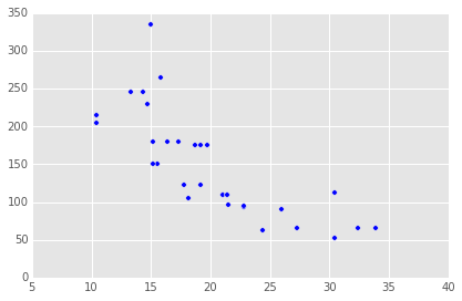
There is also another library called seaborn that brings new styles to matplotlib and more visualization functions. It doesn’t come with the Anaconda distribution, but it’s really easy to get. You just open a terminal (cmd/powershell on windows), type conda install seaborn and you’re done. Now you just load it to get more beautiful plots and can begin to use fun plots like the regplot, which performs linear regression directly in the plot. Plot, plot. I’m setting the figure size because seaborn figures come out a little bigger and
import seaborn as sns
plt.figure(figsize=(5, 4))

sns.regplot('mpg','hp',data=cars)
<matplotlib.axes._subplots.AxesSubplot at 0xc96cc88>
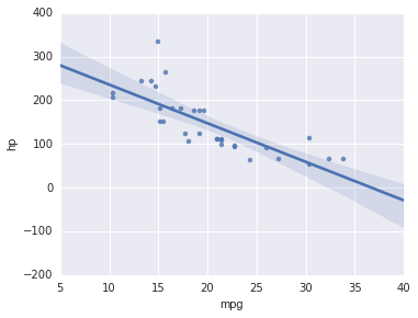
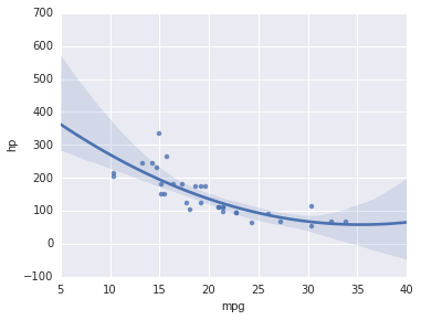
The dependence doesn’t seem to be linear, let’s try a polinomial regression.
plt.figure(figsize=(5, 4))
sns.regplot('mpg','hp',data=cars,order=2)
<matplotlib.axes._subplots.AxesSubplot at 0xc679908>
One of the things I didn’t like about R, or more specifically R on Windows, is that plots don’t seem to have any anti-aliasing. I haven’t had that problem in Python, although you wouldn’t notice anyway since these graphs are all un PNG format now, which would look equally great if I generated them in R. I took a screenshot with an equivalent plot generated in RStudio:
library(ggplot2)

cars <- mtcars

ggplot(data = cars, aes(x=mpg,y=hp)) + geom_point() +
  stat_smooth(method="lm",formula = y ~ poly(x,2,raw=TRUE))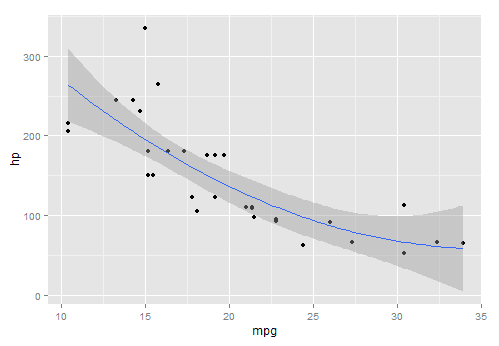
Look at that horrible line!
If you have a workaround for turning on antialiasing on R for Windows I would very much appreciate it, since I’ve searched hungrily for it.
There’s a ggplot library for Python too, although I read that it is a little buggy still. It would be really convenient to use the same graphic language when moving between Python and R. I needed to install it too by running pip install ggplot in the terminal. Notice that the gsize variable is just format and it’s not necessary.
from ggplot import *
gsize = theme_matplotlib(rc={"figure.figsize": "5, 4"}, matplotlib_defaults=False)

ggplot(aes(x='mpg',y='hp'),data = cars) + geom_point() + gsize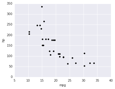
<ggplot: (-9223372036841740621)>
I dropped the stat_smooth because there’s no way to specify the model yet, apparently. Anyway there it is.
Remember that you can get this IPython Notebook and others at my Github Page.