Second crawl
22 Aug 2015In the last post I defined a function that perform simulations for the birthday candle problem. This time I want to use it to visualize what happens if I change the parameters of the problem by using this function:
import numpy as np

def candles(n,M):
	Kj=np.zeros(M)
	for j in range(0,M):
		ni=n
		k=0
		while ni>=1:
			ni=ni-np.random.random_integers(1,ni)
			k+=1
		Kj[j]=k
	return np.mean(Kj)
There are several libraries for the things I will do here today (plotting and modelling), but today I’ll use the most straightforward ones. In later posts I plan to learn and write about the other libraries more specifically.
Plotting
I need to load another library, which is the “standard” one for plotting and it’s called matplotlib. (The second line is for the graphs to appear inside the notebook instead of in a new window but I’ll leave it in case someone is using IPython too).
import matplotlib.pyplot as plt
%matplotlib inline
Let’s begin by generating for candles from to and sampling 5 times.
M=5
N=500

K=np.zeros(N)
for n in range(1,N+1):
	K[n-1]=candles(n,M)
For plotting, you “create” the plot, then make customizations (like labels and colors), and then you show it.
plt.plot(K)
plt.ylabel('Rounds')
plt.xlabel('Candles')
plt.show()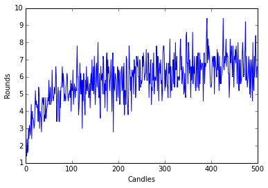
Nice enough. But looks kinda noisy. I’ll change the number of samples per run to .
M=1000
N=500

K=np.zeros(N)
for n in range(1,N+1):
	K[n-1]=candles(n,M)

plt.plot(K)
plt.ylabel('Rounds')
plt.xlabel('Candles')
plt.show()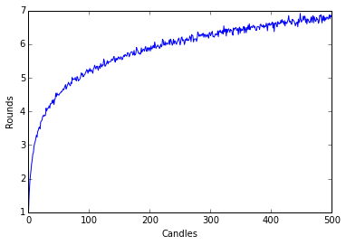
It looks kinda logarithmic. But don’t trust my word for it, lets see the graph of the natural logarithm.
plt.plot(np.log(range(1,500)),'r')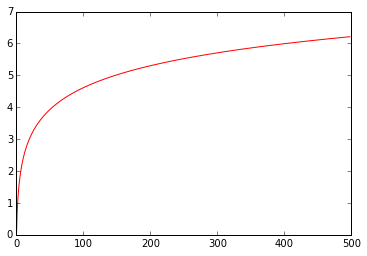
That means we could try to adjust a linear model to the exponential of .
Modelling
First let’s see that looks indeed linear:
plt.plot(np.exp(K),label="Exp(K)")
plt.ylabel('Exp(Rounds)')
plt.xlabel('Candles')
plt.show()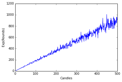
Now we need a library for statistical modelling, so lets call scipy and it’s stats package.
from scipy import stats as statNow I’ll perform linear regression on . This means that I’m trying to find numbers such that plus some noise.
lin_K = stat.linregress(range(1,N+1), y=np.exp(K))
print(lin_K)
LinregressResult(slope=1.7974155631156676, intercept=-1.2491890297652617, rvalue=0.99070255893402914, pvalue=0.0, stderr=0.011060517470059619)
It seems it didn’t crash, so let’s try to plot it.
plt.plot(np.exp(K),label="Average rounds")
plt.plot(lin_K.intercept+lin_K.slope*range(1,N+1),label="Lin_model",color='r')
plt.ylabel('Average rounds')
plt.xlabel('Candles')
plt.legend(loc=4)
plt.show()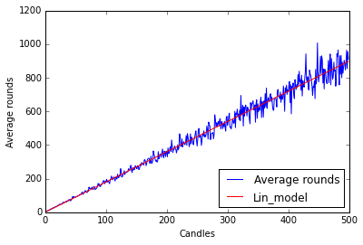
Pretty neat, although I would prefer a linear regression function with some kind of predict function or fitted values but I’ll leave that for other post.
Final graph and thoughts
By transforming back to the logarithm I get the final product:
plt.plot(K,label="Average rounds")
plt.plot(np.log(lin_K.intercept+lin_K.slope*range(1,N+1)),label="Lin_model",color='r')
plt.ylabel('Average rounds')
plt.xlabel('Candles')
plt.title("Rounds ~ log(%s + %s * Candles)" % (lin_K.intercept,lin_K.slope))
plt.legend(loc=4)
plt.show()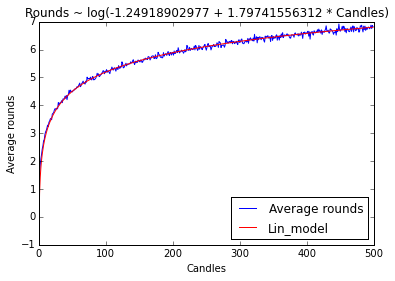
Remember that you can get this IPython Notebook and others at my Github Page.